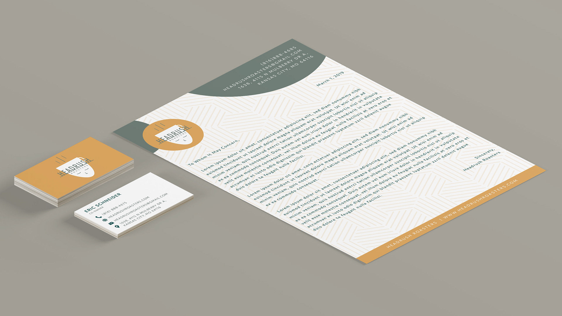
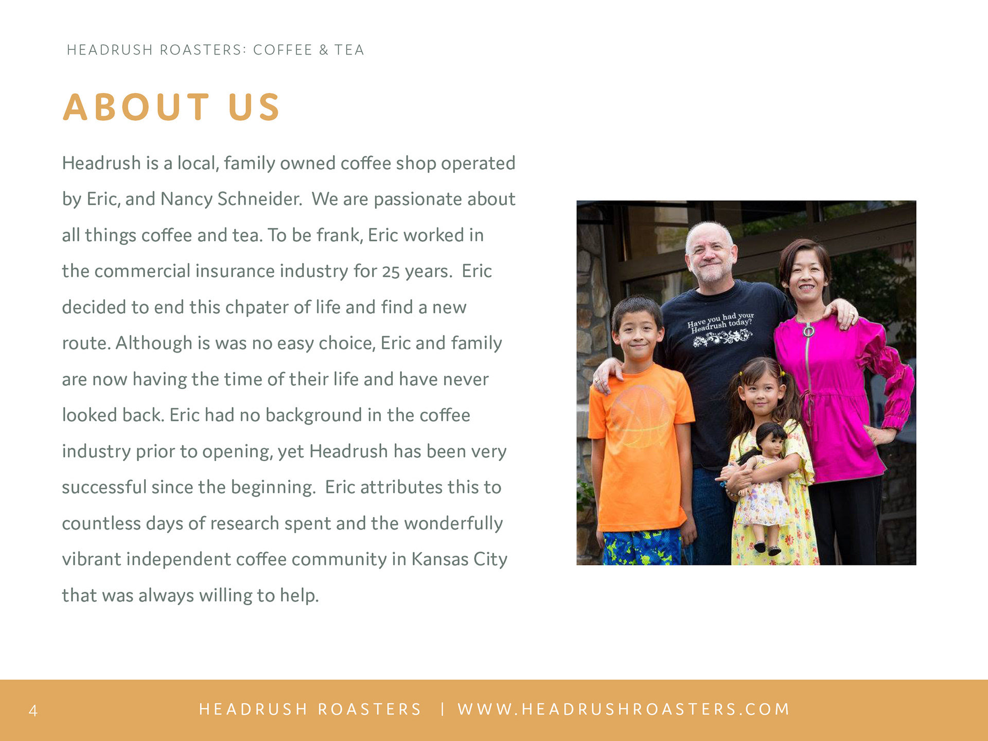
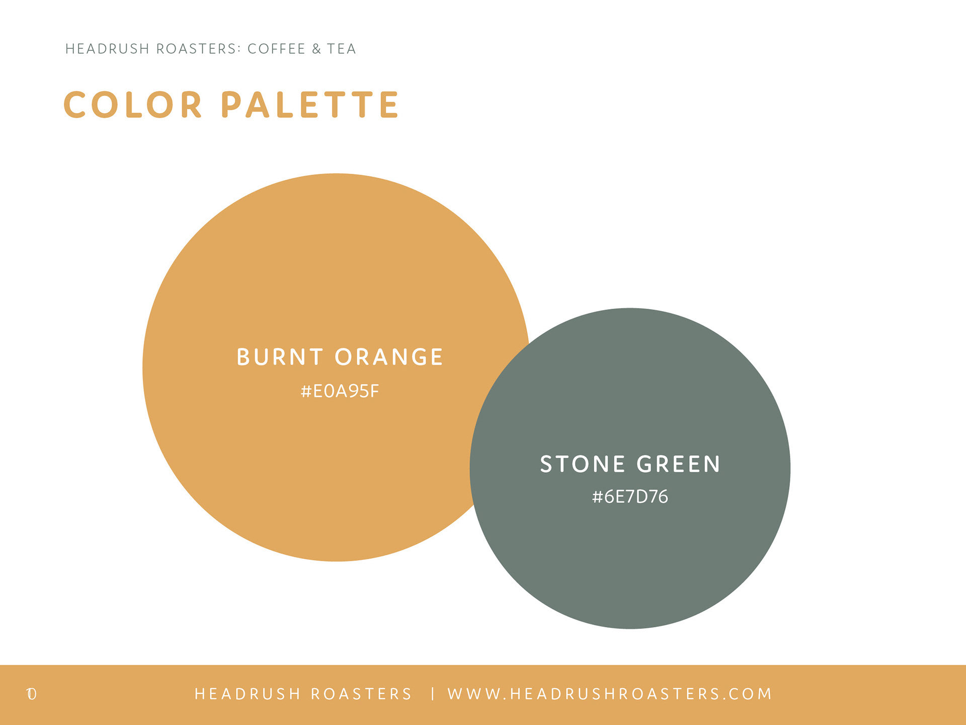
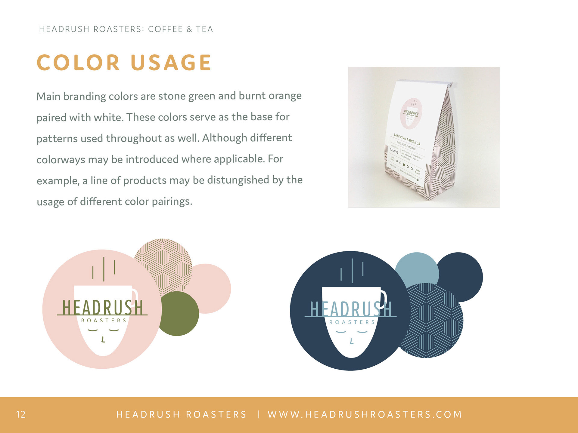
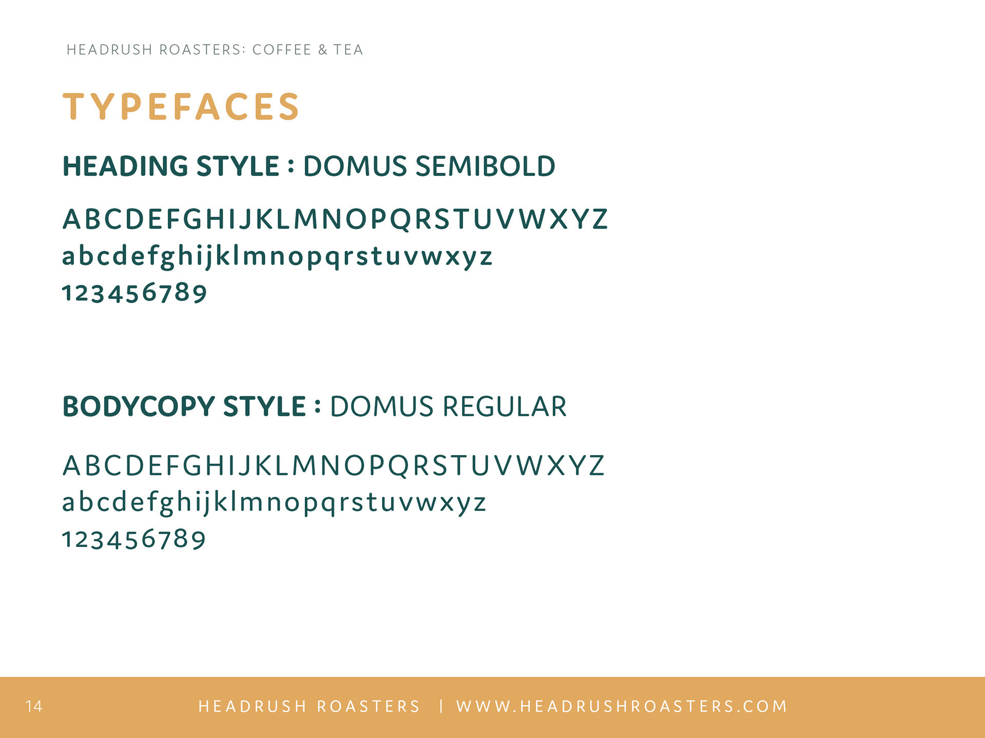
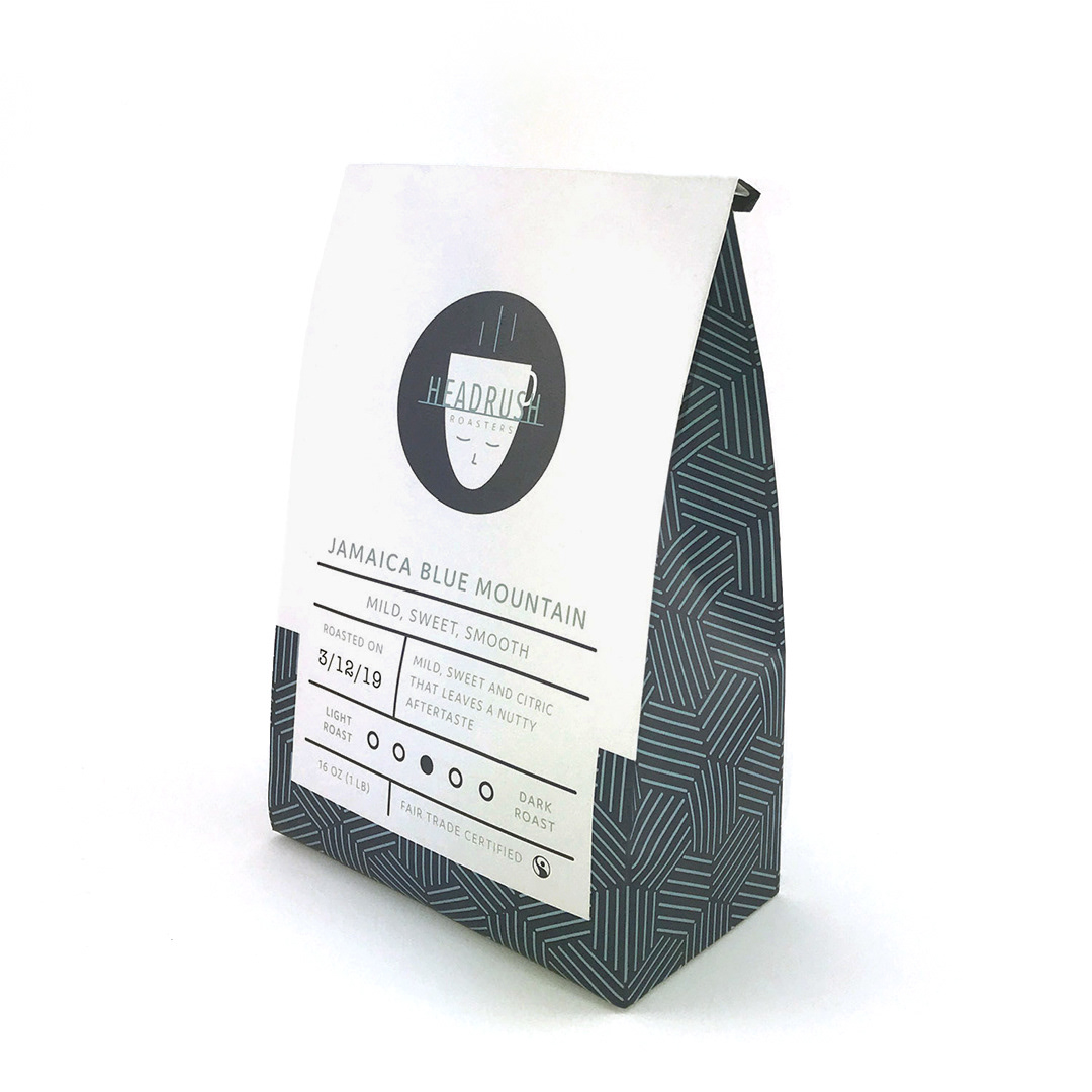
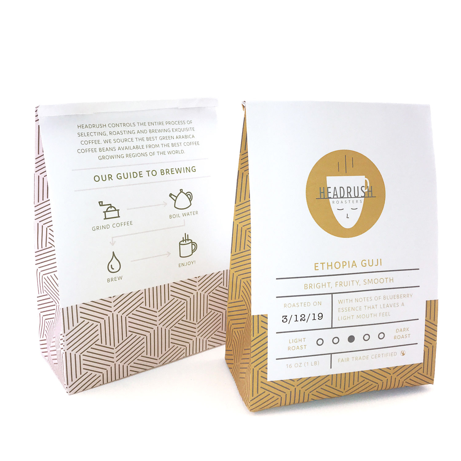
The rebranding of Headrush Roasters was a comprehensive project that encompassed everything from redesigning the logo to updating all promotional materials and creating a branding guide for future use. The existing branding was outdated and did not reflect the café's growing popularity or meet the visual standards that matched its high-quality products and service.
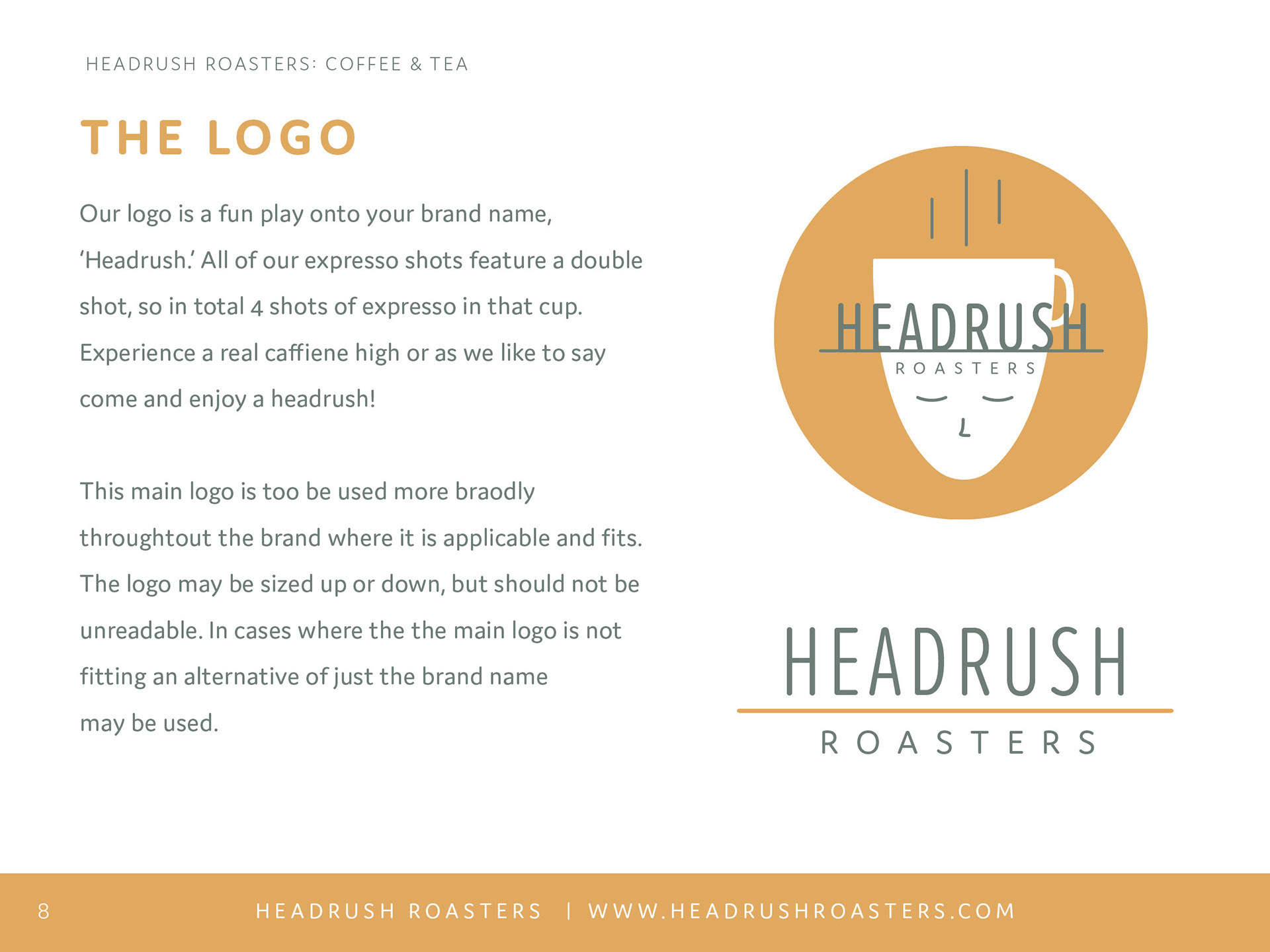
With the new design, I aimed to make Headrush Roasters instantly recognizable at a glance. The name “Headrush” originates from the fact that all their espresso drinks are served with a double shot, providing customers with that signature "Headrush" experience.
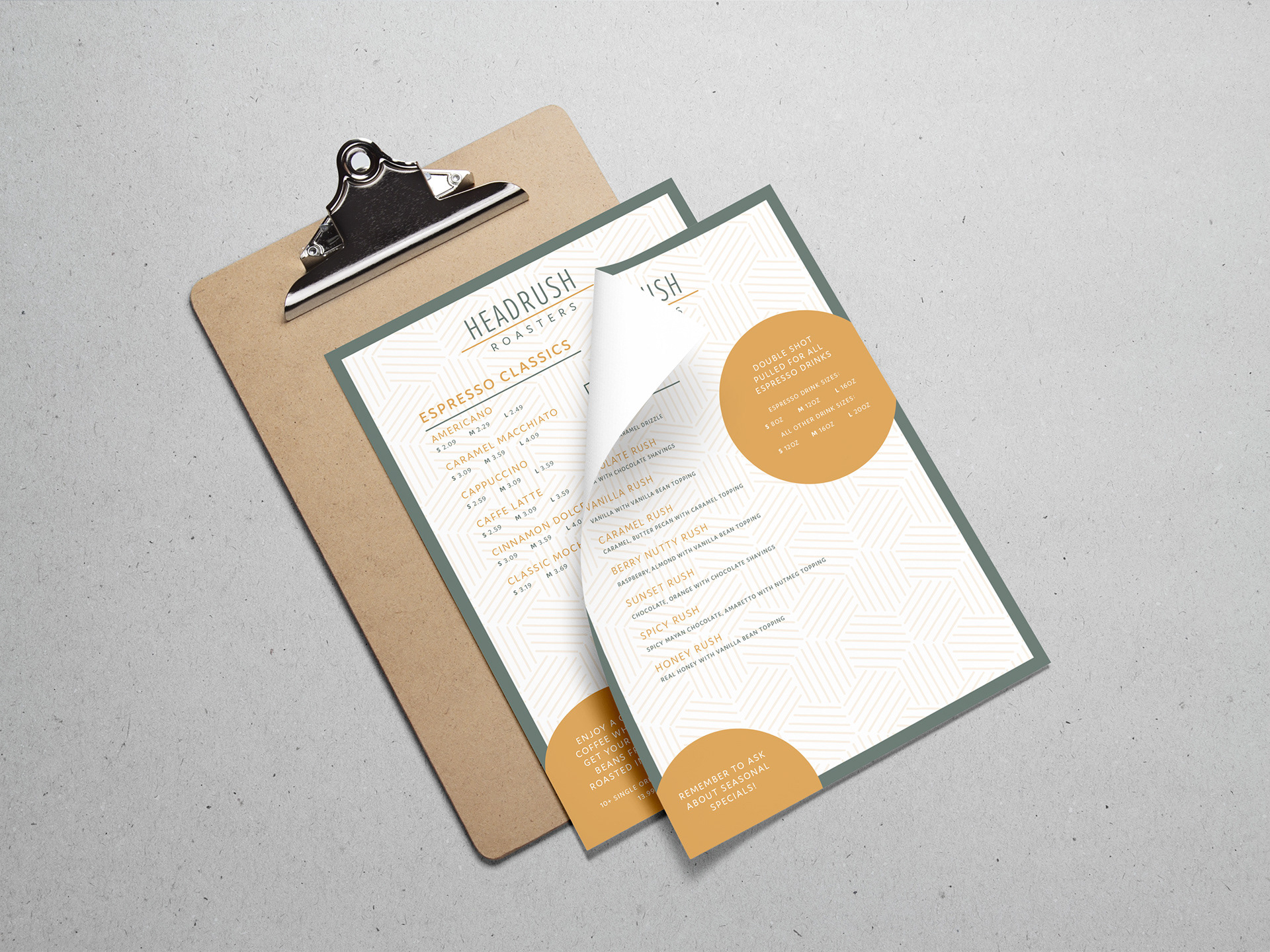
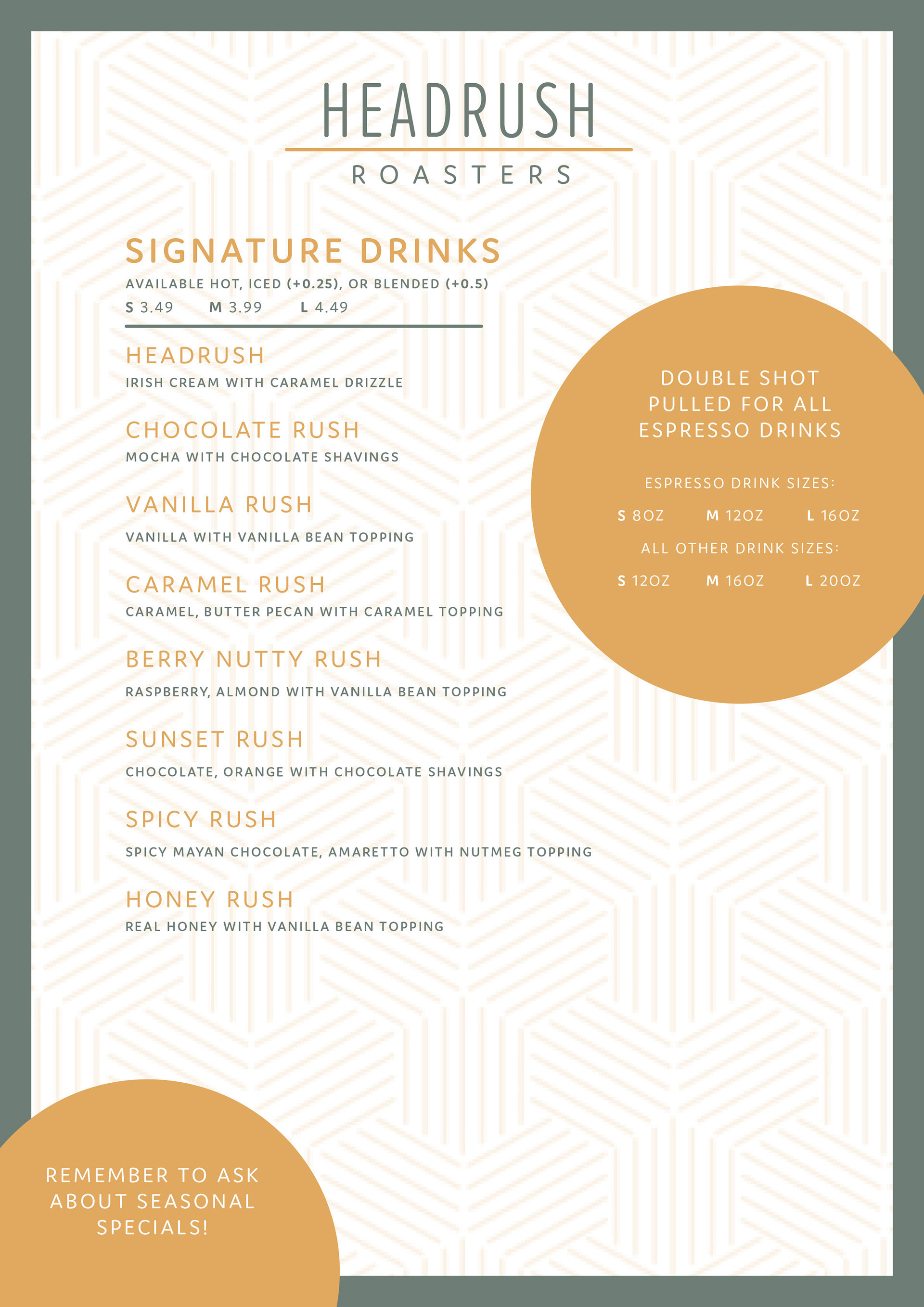
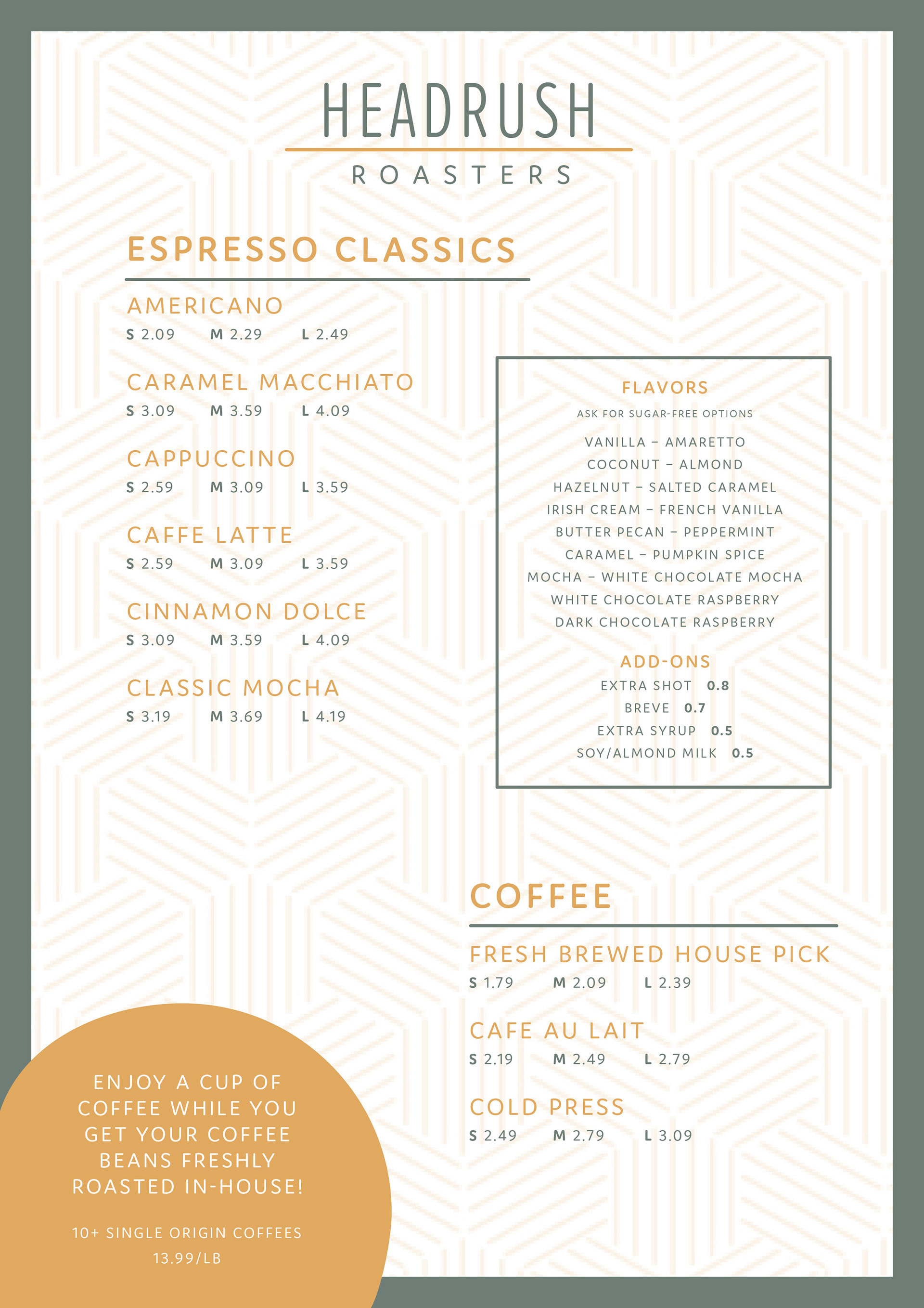
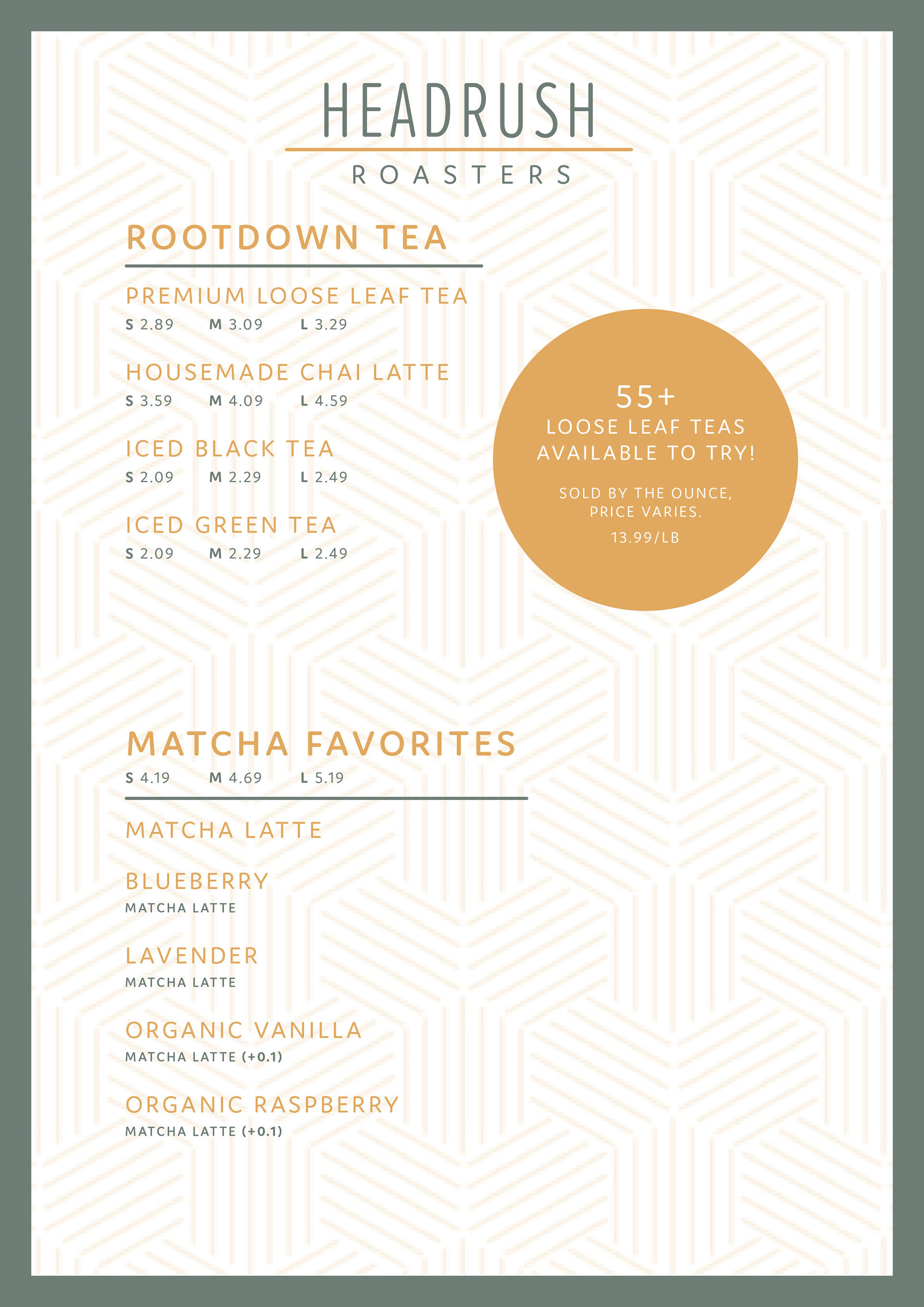
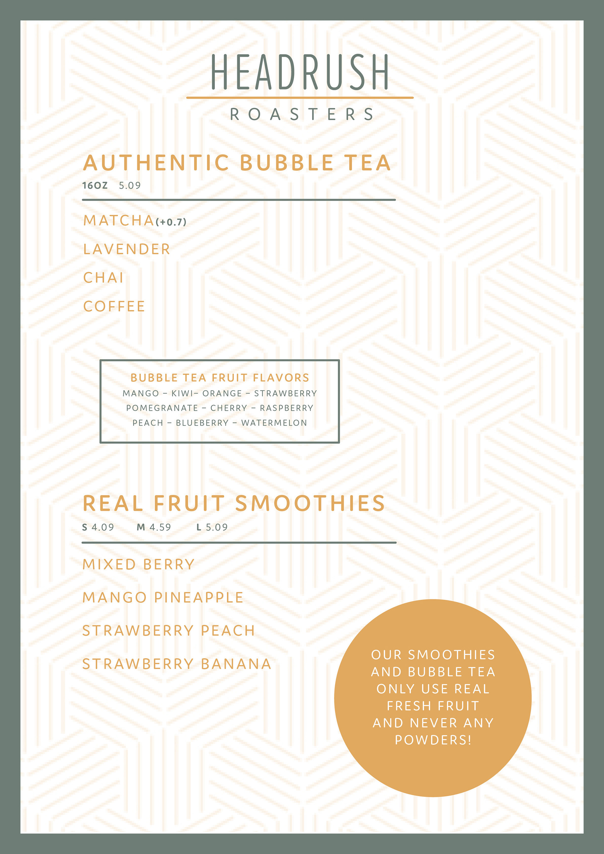
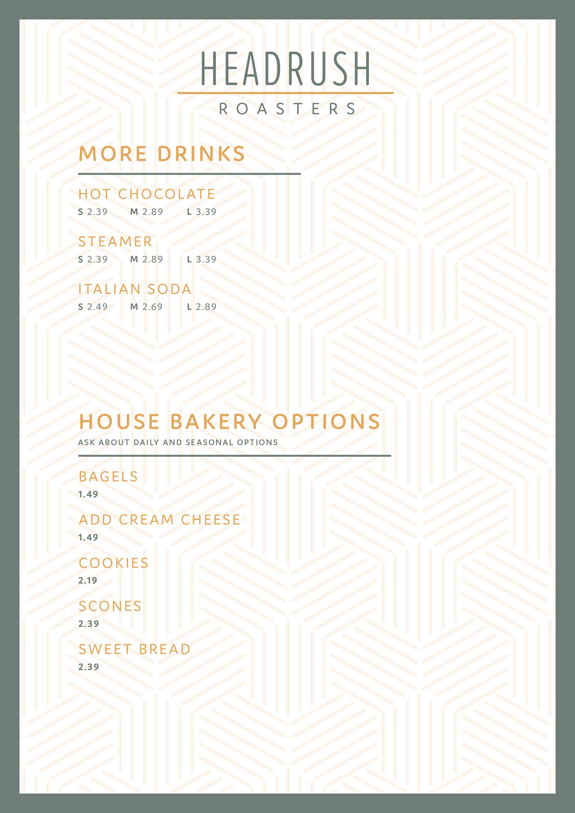
At Headrush, they serve coffee, tea, and bakery items. With a wide variety of flavors and sizes available for their coffees and teas, the challenge in designing the menu was creating a clean layout that still included all the necessary information.
To achieve this, I incorporated a subtle background pattern that added a touch of visual interest without overwhelming the design. The simple text structures provided clarity while maintaining an aesthetic appeal. Their previous menu was overly crowded, so it was essential to ensure the new menu had sufficient spacing to improve readability and enhance the overall customer experience.
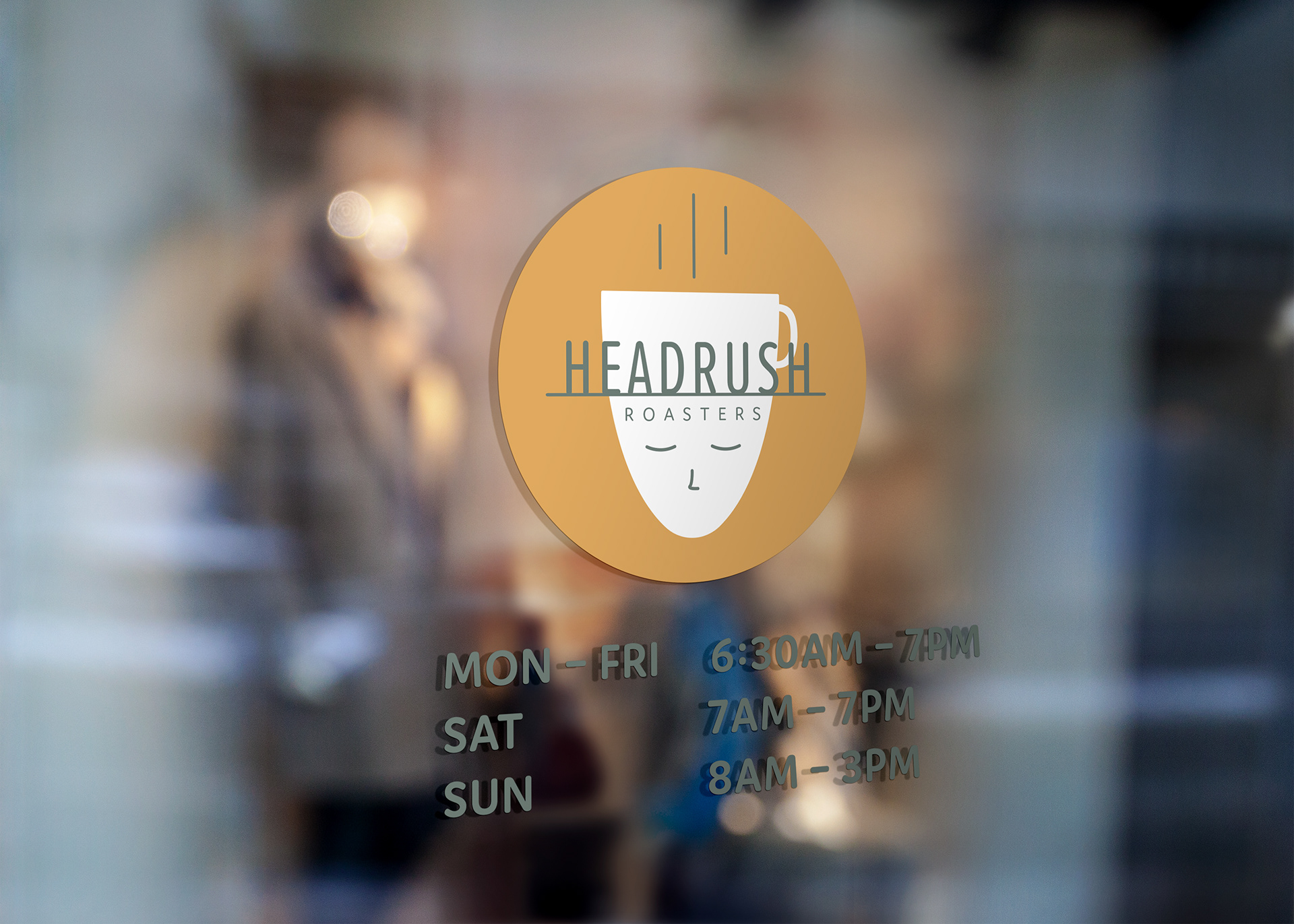
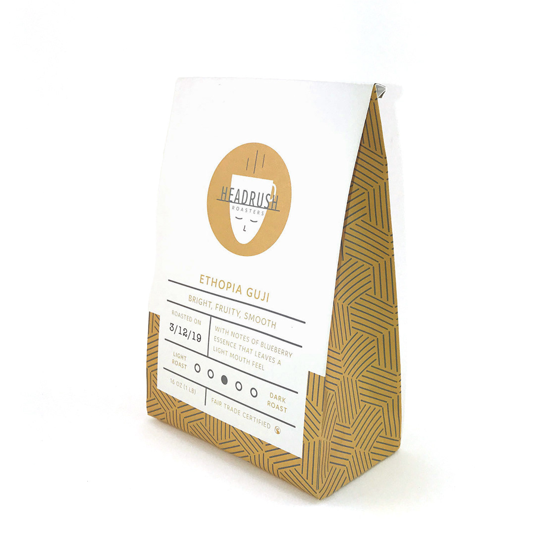
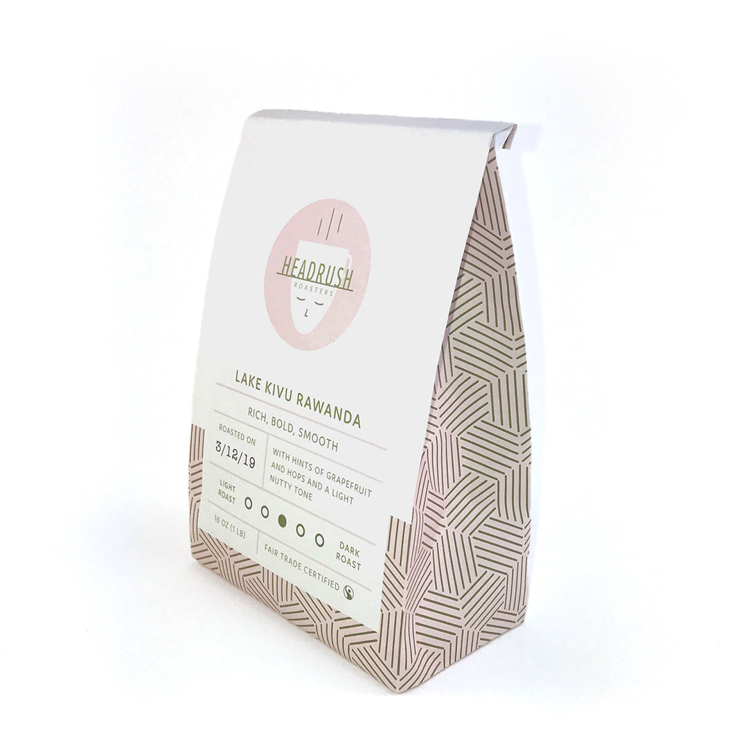

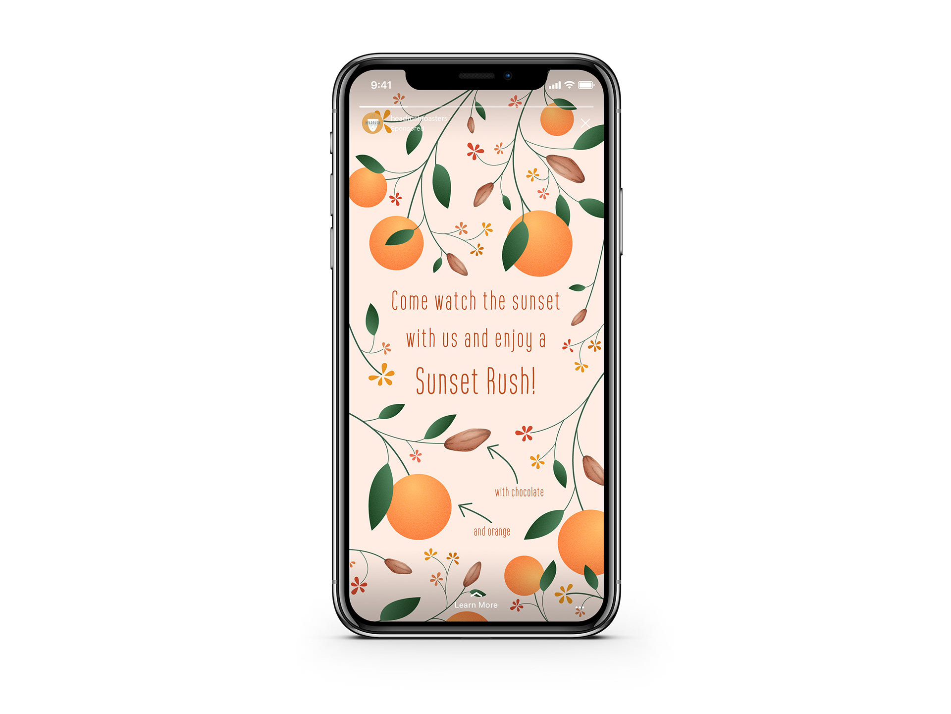
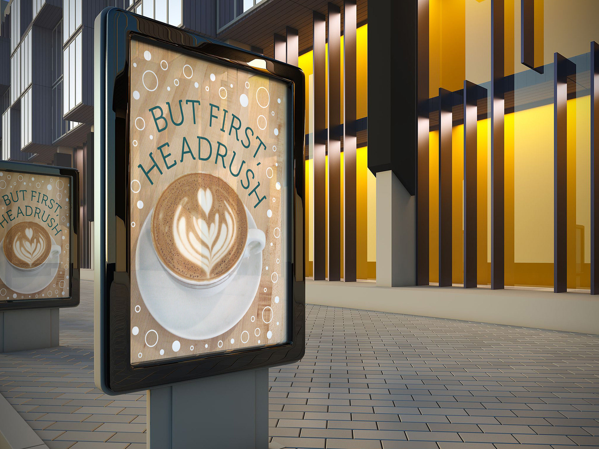
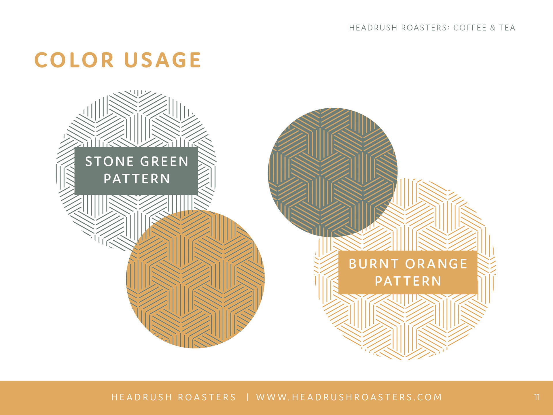
The simplicity and cleanliness of the branding provide a versatile foundation for creating various types of media. As long as the media maintains a high-quality standard and remains simple yet engaging, numerous approaches to promotional materials can be successfully employed.
With their unique drink options, Headrush Roasters has excellent content to share on social media, allowing them to connect with their audience and showcase their offerings in creative and appealing ways.